Member-only story
UX Short: Bad UX forgets context
There’s no remedy for a mismatched mindset
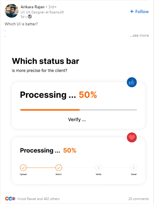
Picture this: it’s a slow Friday afternoon and you’re scrolling through LinkedIn for a quick moment to catch up on the latest and greatest gossip. And you stumble upon this:

I get it: bashing on these types of posts is already played out, but there is one simple thing that you could include that would make these posts 10x better — include the context.
Context is integral for UX
Some key questions I would ask about this UI are:
- How much information do the users need to know? Do they need to know the stage that the processing at?
- Why would they need to know the stage? Only for troubleshooting? Or do they need to know the stage for reporting to management?
- What are the challenges facing the users? Are they an older generation who would need consideration forage-related macular degeneration? Or are they blind or low-vision, and may be using screen readers?
- Are there sub-actions that need to be communicated? Do the status indicators double as buttons that expand to show more information?
Interested in becoming a medium member? If you do end up doing so, please do so through a creator’s link. When you do so, you support your creator directly every month, allowing them to continue to write the articles.
